

Let me start this blog post with a confession – the last six months have been a roller coaster for me. It’s been a lot of fun, but also a lot of work. Basically, I’ve been doing two jobs at the same time.
On one side I was working on the content and presentations about airline ancillary revenue best practices. I was writing and creating materials about upselling and cross-selling and doing experiments with airline merchandising.
On the other front, I was managing e-commerce for online car rental website. The main focus was on growing the online sales by optimizing the conversion rate.
2020 NOTE: We published the biggest airline digital optimization research ever done with data from 49 surveyed airlines >> The 2020 Airline Digital Optimization Yearbook
For me, the latter is always exciting, as I like to do hands-on e-commerce work and experiments. I like being in the trenches. And as a consultant, it’s always better to preach about something that you actually do. 🙂
Personally, the experience has been great. The two activities are complementary. What I learn from one area can be applied to the other, and vice versa.
Actually, this is exactly how one such idea and experiment happened.
The results were great, so read on.
I got the first glimpse of this idea as I was working on this extensive article about upselling and cross-selling. This is when I first started analyzing the trends and best practices of airline branded fares upselling in detail.
As I went deeper into the analysis of what airlines do to upsell before the booking, some of the examples and especially results really intrigued me.
Because of the bar and competition low-cost airlines (LCCs) set and the competition they create, most of the full-service airlines are unbundling their products as well. Many later re-bundle products as branded fares, using the cheaper branded fares as a tactic to compete with the LCCs.
This strategy and the rise of a-la-carte ancillary products is really not anything new. It’s something that’s been happening in the airline industry for the last 10+ years. The latest to jump on this bandwagon were the North American airlines (United Airlines, American Airlines, Delta Airlines) in an attempt to compete with their low-cost competition.
So, it wasn’t the bundling and branded fares upselling that caught my attention. What intrigued me were the actual results.
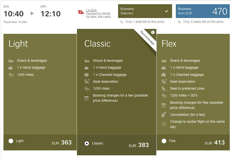
When American Airlines introduced their unbundled basic economy product, 50% of the customers were still selecting the upsell – the main cabin seat. Two years ago when Lufthansa Group did a similar unbundling, Austrian Airlines published similarly amazing results (approximately 50% of customers still going for the upsell).
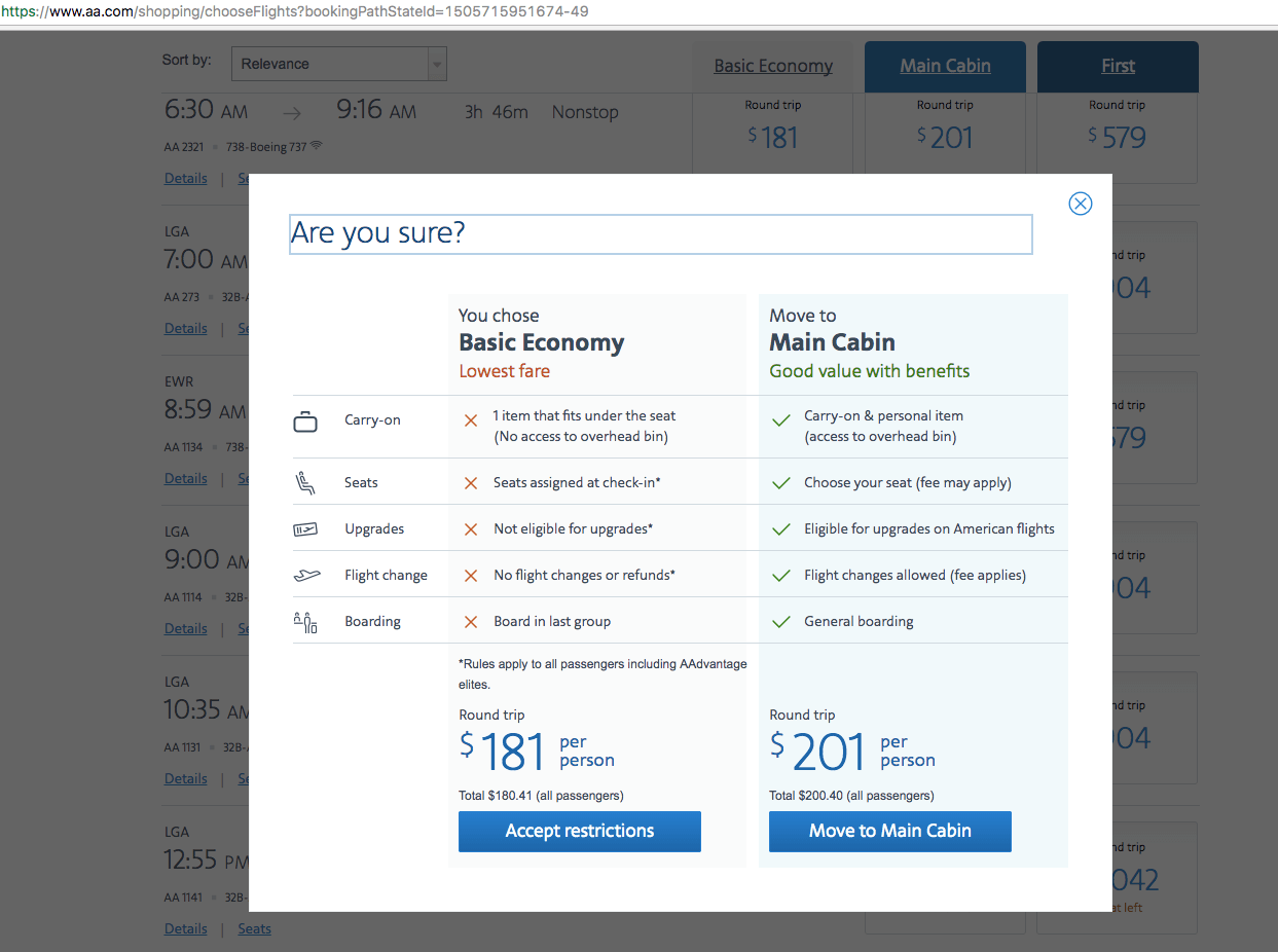
Airline branded fares upsell example (American Airlines)
I won’t go into the discussion regarding whether or not American Airlines’ decision not to decrease the price of the cheaper, unbundled product is the right one in the long run. However, you can use our special upsell calculator to calculate the potential additional revenue such a process can create.
What actually caught my eye, though, was the e-commerce and user experience (UX) aspect of it.
Can you sell more for a higher price if you create additional product bundles and compare them to an existing one?
This is when I thought of our car rental online booking process and an upsell that is crucial for every car rental or online car broker business.
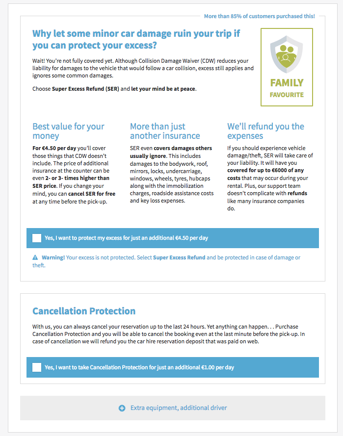
To put it very simply, (up)selling insurance and excess coverage is make-or-break for every online car rental business. The margins on the car rental alone are so low that generating additional ancillary revenue from this upsell is a must to achieve profitability.
However, what most of the car rental websites do is upsell the excess coverage (sometimes called full coverage, or excess refund) as an additional a-la-carte ancillary product.
This usually happens in the second step of the booking funnel, after the customer has selected the core product (actual car in the first step).
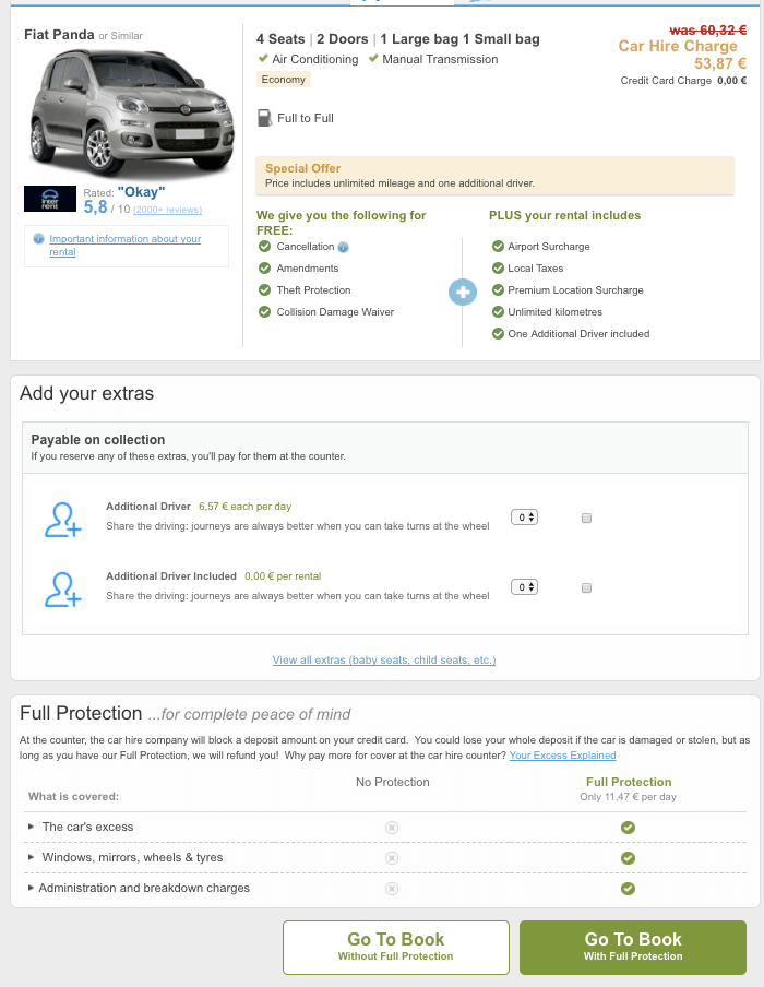
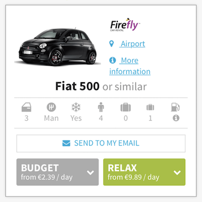
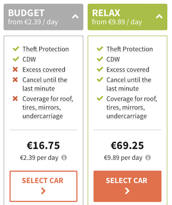
Here you can see an example of how Rentalcars.com does the Full Protection upsell after the user has selected his or her car (check the buttons at the bottom of the picture):
We were doing something similar in our case with the car rental business with the “excess refund” ancillary product upsell. First we displayed cars (core products) as the search results. Then offered an upsell with the “excess refund” as a standalone product at the second step of the booking:
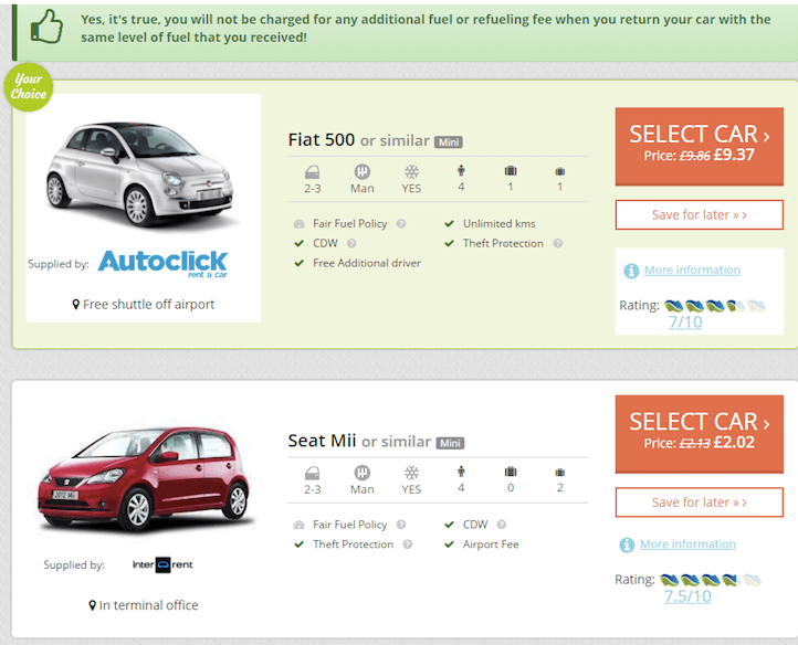
We were optimizing conversion on this second page on a regular basis to increase the “excess refund” ancillary product uptake rates. The increases were constant, but linear.
However, these airline branded fares upsell examples made me wonder if we could achieve a more significant increase.
Was there an opportunity to “bundle” the core ancillary product into the main product and increase the total upsell?
In other words, could we create a “bundle” and include the “excess refund” as a way for our users to see it as an added value?
Based on the results of the airlines’ branded fares my assumption was – yes, it’s worth a try.
So, this became the test hypothesis for our small conversion optimization team.
Before I start explaining in detail how we did the whole process, let me state one thing:
For me, conversion rate optimization is not a growth hack or set of tricks. It’s not about testing whether a red button converts better than a green one.
Conversion optimization is a holistic approach, and understanding your users is at the core of it.
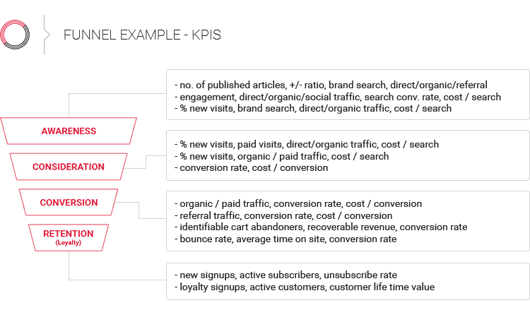
You can read in detail about the theory of the conversion optimization process here. I use the 4-step framework with measure, analyze, optimize and test phases.
Now, let me show you how we implemented an airline-style branded fares bundle upsell into our car rental process:
Conversion rate optimization is not possible without data. If you don’t measure, or don’t measure the right things, you can’t optimize.
For our experiment we focused on the following key metrics:
We measured the first three metrics in our web analytics system (Google Analytics). In addition, we measured the uptake % of excess product in our backend BI system. Especially BI metrics and values per key source markets and customer segments gave us an understanding of key % uptake trends.
An agile BI system that helps you find trends in your data is huge added-value in such projects.
OK, so once we’d defined the metrics and collected the (quantitative) data, we now had an indication of WHAT was happening.
The next step was to understand the WHY.
To really understand our customers, we needed to understand their “WHY.”
Why do they buy the current excess product? Why don’t they buy? What are their fears?
The biggest mistake here is to assume. As the old saying goes:
“To assume means you make an ass out of you and me.”
So, instead of assuming, just ask. Ask your users, your customers.
I’m a big proponent of an agile approach to getting your users’ feedback. Instead of long-term market and customer research, we tried using quicker and simpler digital means to understand our users.
How we got feedback from our users:
The “why not” survey (why users didn’t buy the excess refund product) in particular gave us the information needed to classify the reasons into key categories and understand the key obstacles.
This knowledge is crucial for all activities in the next step (design, copy, visual elements, etc.).
Based on the quantitative data (analytics from web analytics and BI) and above-mentioned qualitative data, we were confident going into the next step.
The key challenge of our web UX team was to design the new “challenger” version of the booking funnel.
Instead of upselling the excess refund only as a standalone product on the second step in the funnel, we decided to bundle it into the main product on the first search results page. We wanted to test how this new bundled version would perform compared to the old display.
Bundles upsell – Best practices
Before going into the design phase, we reviewed some of the best practices of airline branded fares upselling, as well as some similar car rental concepts.
The best airlines clearly communicate their branded fares benefits and differentiate between them in a clear (benefits, added value) and clean (no clutter, no friction) way.
Swiss Airlines is a good example of such C & C (clear and clean) design:
On the other hand, I don’t believe it’s a good idea to communicate limitations, restrictions and policies in a product bundles comparison (many airlines still do that).
I won’t go into full detail about all the iterations we created in our design process. At this point, I just want to emphasize one area.
Personally, I believe that the most important thing about product bundles is to show your users how the bundle adds value (not only show the features).
We did the following when designing our product bundles:
Below you can see the design of the “challenger” version:
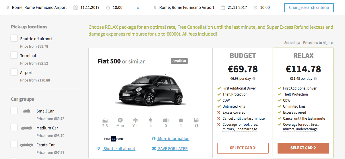
New design using product bundles and upsell (Variant version)
When you’re making such significant changes to your booking funnel, a special mobile flow is needed.
In our case we didn’t use the same design that merely looks good (responsive) on mobile. Instead, we created an entirely different user experience.
Key elements of the mobile design:
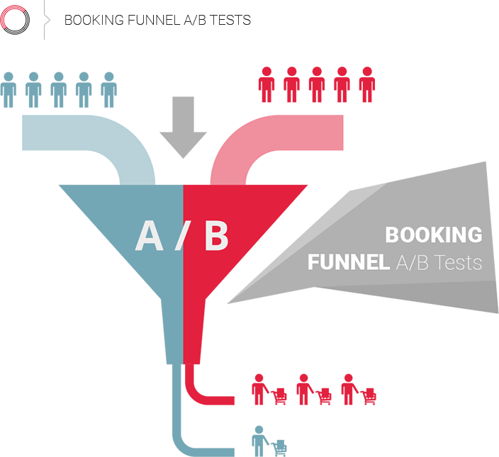
Once the Optimize phase was complete and the “challenger” (variant) had been created, we needed to A/B test it against the original. Since we’d changed the mechanics of the booking flow, we needed two versions of the booking system.
A/B testing the changes within your funnel can be a challenge. A lot of travel (especially airline) booking engines still don’t support A/B testing. Needless to say, however, without proper testing it’s not possible to optimize conversions as everything is based on assumptions. You can read more about booking funnel analytics in this article.
In our case, we created two instances of a booking engine (funnel) and used special events in our analytics to track the performance of each version.

Calculating significance for our A/B test
Additionally, since we didn’t only measure the changes in conversion rate, but also the average order value (which included the upsell %) and per session value, our significance calculation was a bit more complex.
Most of the calculators used to compute significance use conversion rate only. In our case, this was not enough. Here is a resource that helped us with calculating significance using revenue as well.
I must admit, our A/B test results surprised me. Personally, I didn’t expect such a difference.
So here are the results of our Bundle product experiment:
The final result was great, presenting a 13% increase in revenue. However, the biggest win was going through the whole process and the results with the team.
And this is what conversion rate optimization is all about: a constant learning process to know and understand your customers better.

Barbara
Hi, do you know what IT companies offers this product to implement in an airlines company?
Iztok Franko
Hi Barbara – if you want to learn more about how to do conversion optimization and upselling and cross-selling to increase ancillary revenue you can contact me at iztok dot franko at diggintravel dot com